How Big Are Countries Really? Compare Real Sizes Without Map Distortion
Ever wondered the countries look bigger on map are actually small and the countries look smaller on map are actually quite big?
Why does Greenland look bigger than Africa on most maps? Is Russia really that massive, or is the map lying to us? And how on earth does a tiny-looking country like Brazil actually span an entire continent?
You've probably stared at a flat world map and felt that something was off — without realizing you were right. Ever felt like your world map was lying to you? It actually is. Because the Earth is a sphere being flattened onto a 2D surface, standard maps use the Mercator projection, which drastically stretches landmasses near the poles while shrinking those near the equator.
Instantly see the real size of any country without the distortion caused by traditional map projections like Mercator. No more guessing — just honest geography.
Application Key Features:
User Guide: Step by Step Guide to Use True Size of Countries Map Application
This guide will help you to use this free application for education purposes.
Step 1: Search Country Name
Start typing in search bar. Country names will be suggested in drop down.
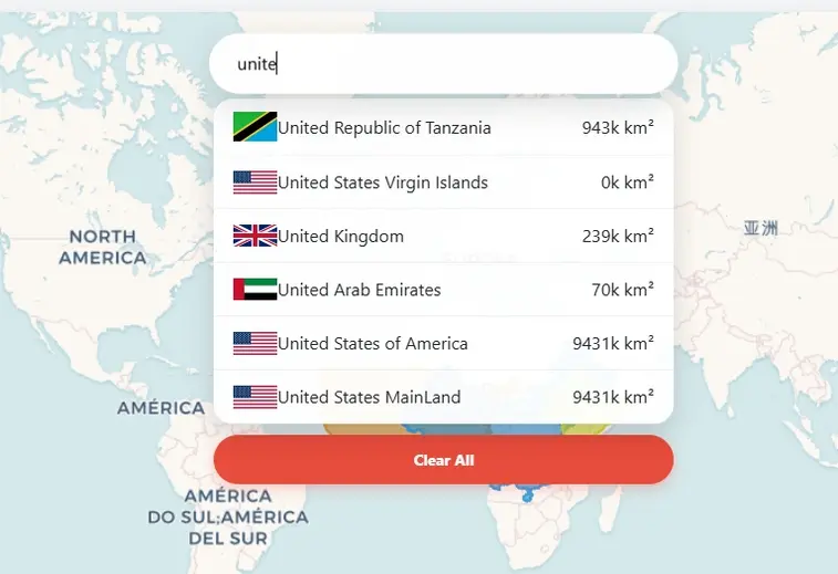
Step 2: Select Country
Select country from the dropdown list and click. Map will show the search country and zoomed to its location.
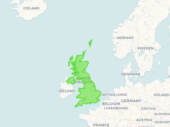
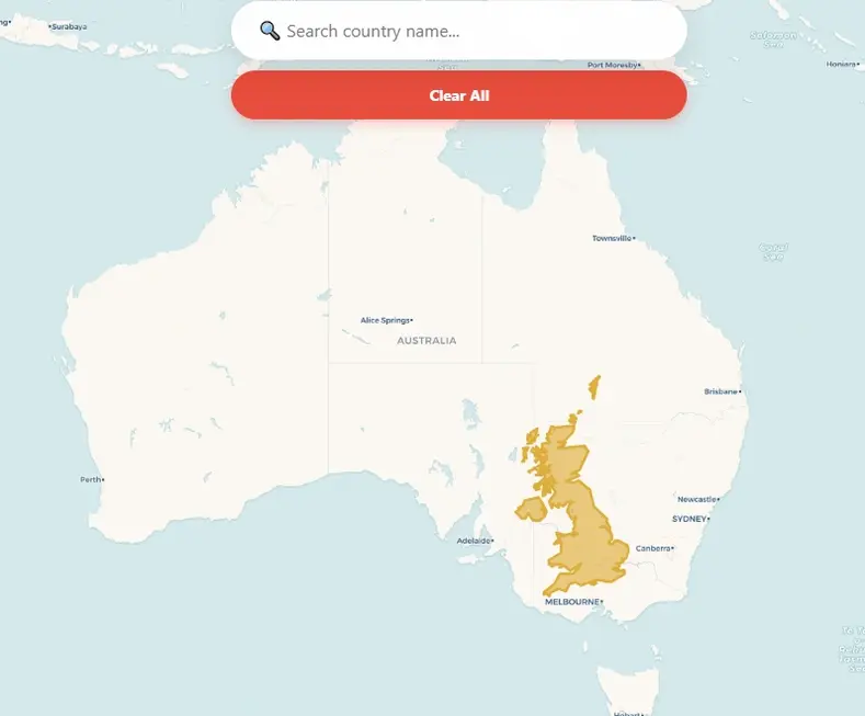
Step 3: Drag Country on Map
Click on the country map and hold. Now you can drag it anywhere on map to compare the size with other countries. While you are dragging it will show the area of country in square km and percentage of map distortion due to projection.
Step 4: Reset Map & Clear the Results
Just press clear button then it will reset the application with blank world map.
For centuries, mapmakers have used projections (like the famous Mercator) that stretch countries near the poles to make them look enormous, while shrinking those near the equator. The result? A world where Europe appears larger than South America (it's not), Alaska looks as big as Mexico (nowhere close), and Antarctica seems to go on forever. But here, on this distortion-free map, you can finally get honest answers. Drag any country, drop it next to another, and see for yourself: the world isn't quite shaped the way you were taught. Prepare to have your mental map — literally — turned upside down.
A Brief History of the Projections
The history of map projections is essentially a 2,000-year-long struggle to solve a single mathematical impossibility: flattening a sphere onto a plane without tearing or stretching it.
The goal was not the creation of the perfect, all-encompassing data format, but the development of a simple, efficient way for geospatial data to be displayed and worked with on the increasingly powerful desktop computers of the era.
The Ancient Roots
Mapping began with the Greeks, who were among the first to acknowledge the Earth as a sphere. Ptolemy (c. 150 AD): In his work Geographia, he developed the first systematic methods for projecting the curved Earth. He used conic projections, where the Earth is projected onto a cone placed over the sphere. This preserved some sense of distance but was limited to the "known world" (the ecumene).
The Age of Navigation: The Mercator Revolution
As global exploration exploded in the 16th century, sailors needed a map they could actually navigate with.
The Quest for Fairness: Equal-Area Maps
By the 19th and 20th centuries, critics argued that the Mercator projection was "Eurocentric" because it made northern colonial powers look much larger than tropical nations. Gall-Peters Projection (1973): James Gall and later Arno Peters promoted an equal-area projection. It sacrifices shape (stretching continents vertically like "hanging laundry") to ensure that every square inch on the map represents the same number of square miles on Earth. Mollweide Projection: An elliptical projection often used for global data (like climate maps) because it balances the entire world's area accurately.
The Modern Compromise: "Reference" Maps
Cartographers eventually realized that you can't have it all—area, shape, and direction can never be perfectly reconciled. Today, most modern atlases use Compromise Projections. Robinson Projection (1963): Used by National Geographic for decades. It doesn't get area or shape perfectly right, but it "looks" right to the human eye by distorting everything just a little bit. Winkel Tripel (1921): Currently the gold standard for many educational organizations. It minimizes the three types of distortion: area, direction, and distance.
The Digital Age: Web Mercator
Ironically, despite all our progress, the Mercator projection made a massive comeback with the internet. Google Maps and OpenStreetMap use "Web Mercator." Why? Because at the local level (zooming into a city block), it preserves 90-degree angles for street intersections. If they used a different projection, your neighborhood would look skewed and tilted as you scrolled around!
Open Source Resources